Low C02 Ready-meal:
homegrown
Creating a visual identity for a low- CO2 ready-meal company. As well as appealing to an audience who is not currently engaged with this topic.
Graphic design and commercial practice are often tied together; we see and interact with hundreds of brands daily. But what could a ‘visual identity’ look like and do when the aim is sustainability rather than sales?
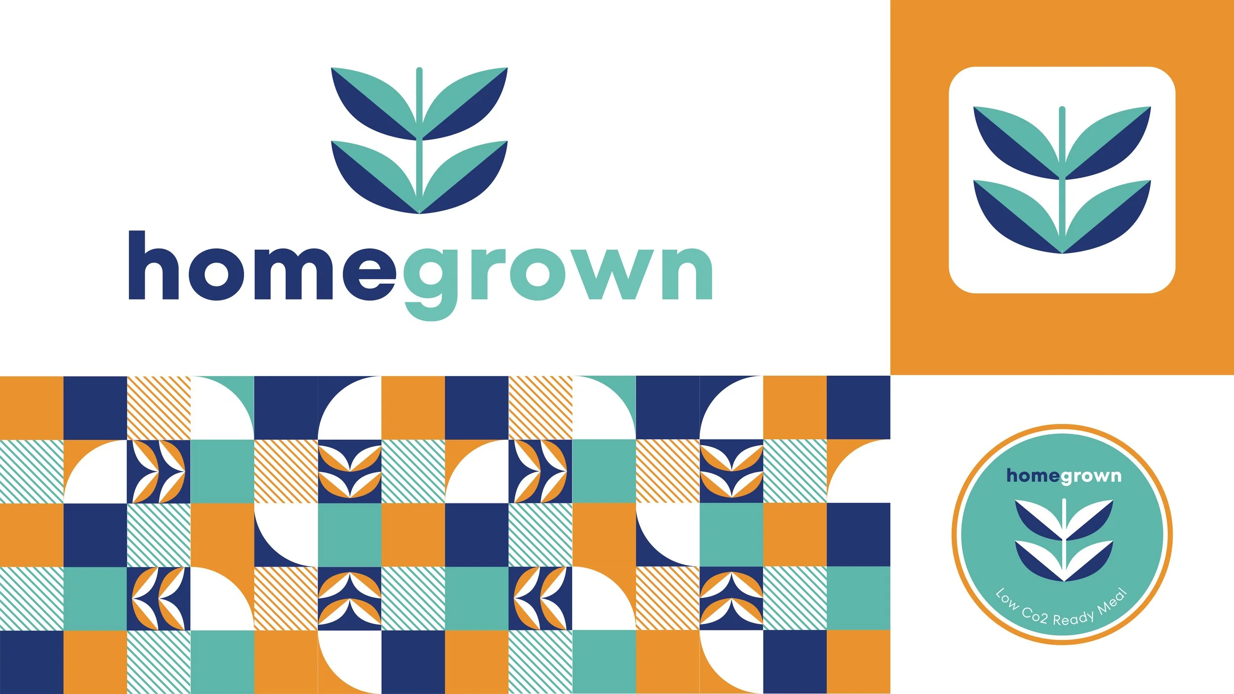
Homegrown targets students (18-25). Those who live away from home and lack time to prepare meals. I have created a trendy, authentic pattern that appeals to this target audience. It is recognisable by its design and colour scheme. I intended to stay away from greenwashing and do something less predictable. It stands out from others on the market. This sustainable food brand is designed to attract students and encourage them to buy it.
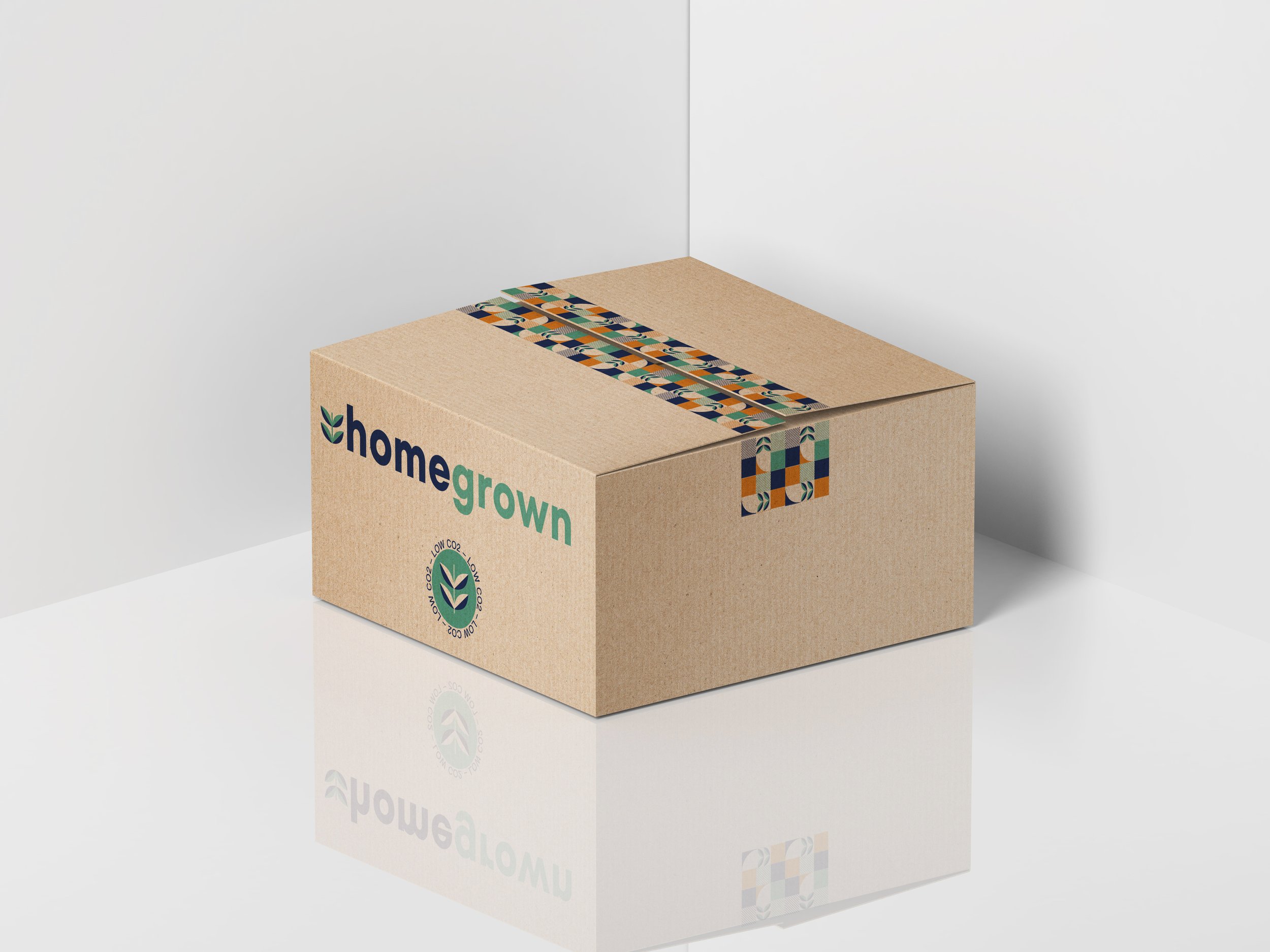
The brand name Homegrown is meaningful, as the food and packaging are only produced in the UK and locally sourced. Homegrown makes life easier. All nutritious ingredients are home-delivered and contain easy recipes to follow. The brand appeal is the low CO2 element. Therefore the packaging needs to reflect this. Packaging with a minimal design uses less ink, having a lower environmental impact. The playful tape on the top of the box highlights the brand.


